.png)
Client
My Role
Platforms
Tools
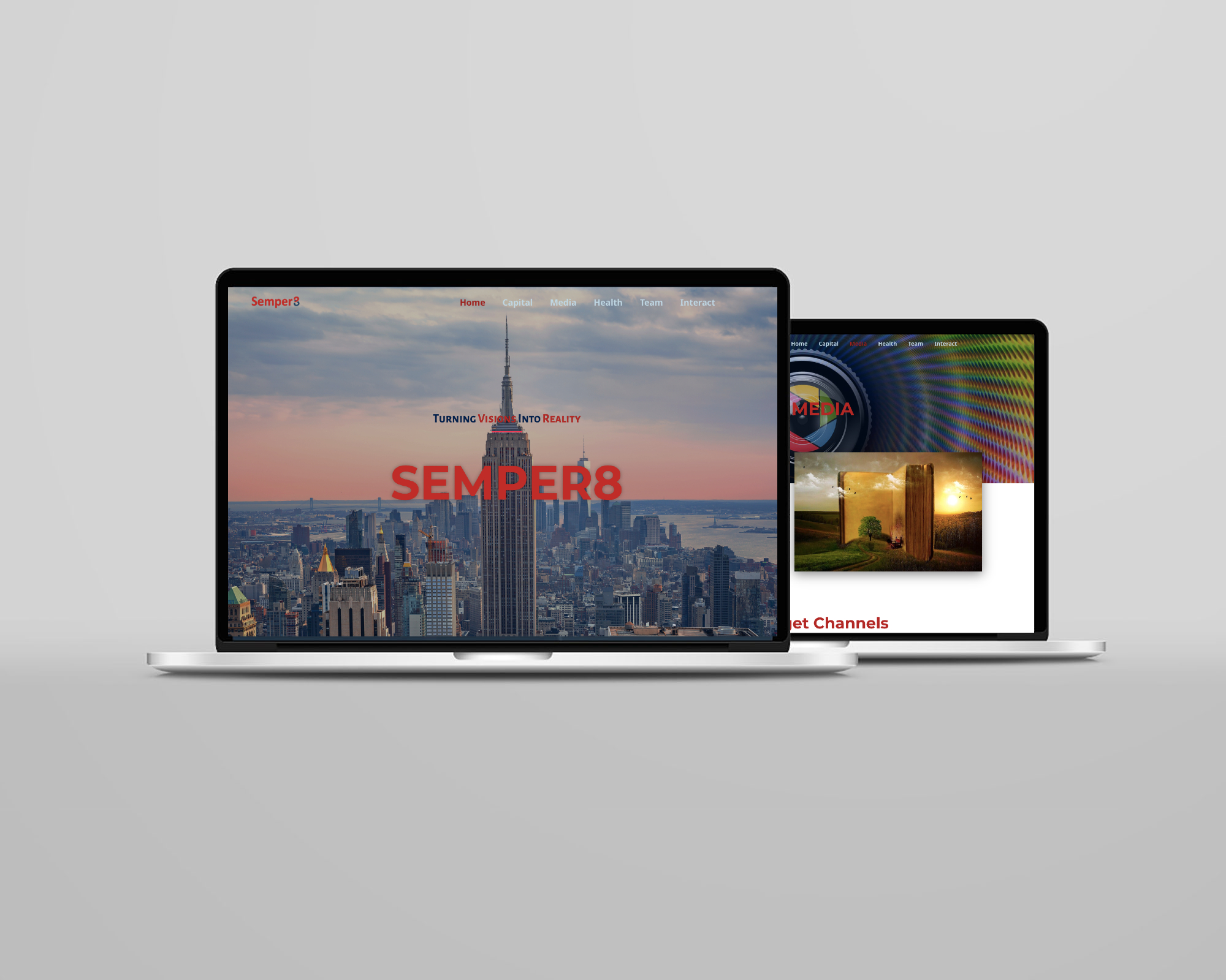
Semper8 encompasses three key affiliations: Capital, Media, and Health. Capital and Health serve as an investment and consulting group, while Semper8 Media focuses on creating thought-provoking content across various genres, including films, publications, and digital platforms.
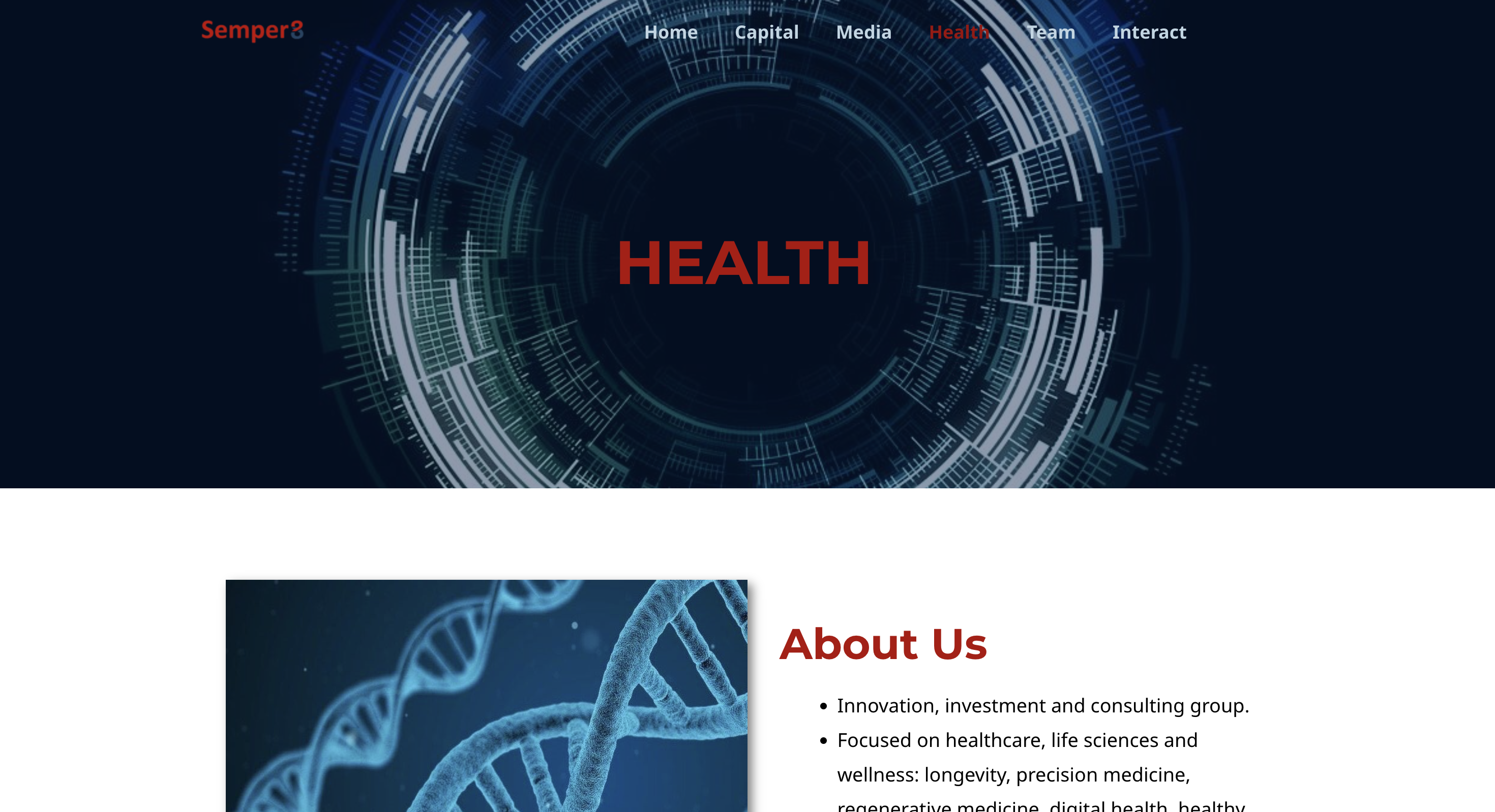
After recognizing the potential of the Semper8 website, I transitioned into the role of UX/UI designer. The existing website had significant limitations and required a comprehensive redesign. Understanding the critical role of the website in shaping Semper8’s image, I embarked on developing an appealing and functional mobile-friendly website. My goal was to create a site that would be easier to maintain, effectively serve clients, and enhance user trust.



.png)


I conducted thorough research on Semper8’s target audience, recognizing that each affiliate—Semper8 Capital, Semper8 Media, and Semper8 Health—caters to distinct clientele. This understanding informed my approach to designing a cohesive website that effectively addresses the diverse needs and interests of each target group.
The clientele ranges from:

B2B operations, encompassing businesses in need of consulting and restructuring services
Investors seeking trusted advisory and partnership opportunities.
Directors and producers interested in the innovative content produced by Semper8 Media.
The original Semper8 website was outdated, lacked essential information about the company and its purpose, and had a confusing UI that often led to dead-end pages. The basic design was not visually appealing and failed to effectively present content regarding Semper8’s three crucial affiliations: Semper8 Capital, Semper8 Media, and Semper8 Health.
To address these issues, I undertook the following initiatives while ensuring the client’s preference for a simple yet visually appealing and well-organized website:
Using Balsamic, I created low-fidelity wireframes of the main pages.
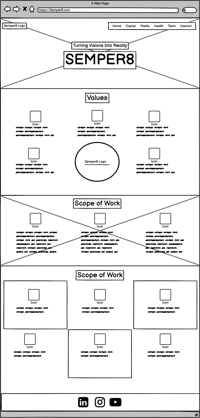
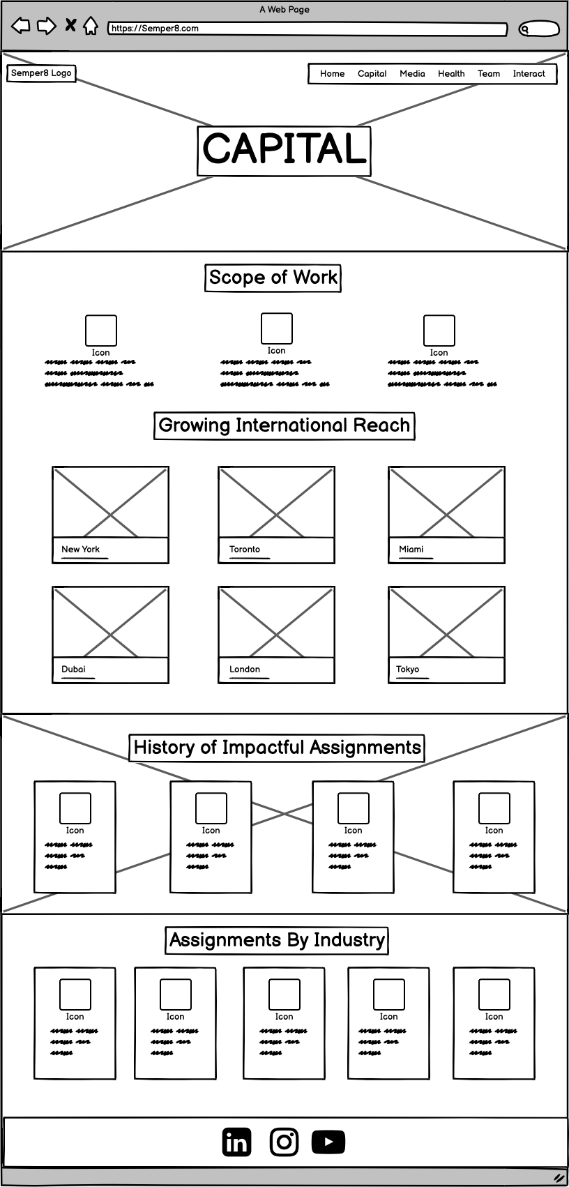
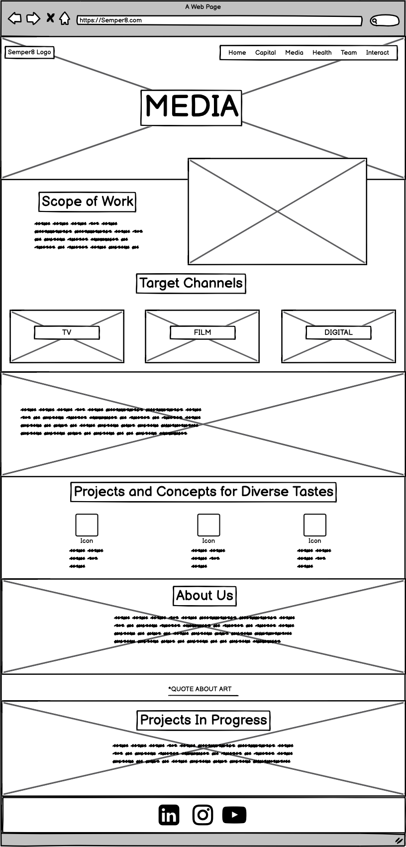
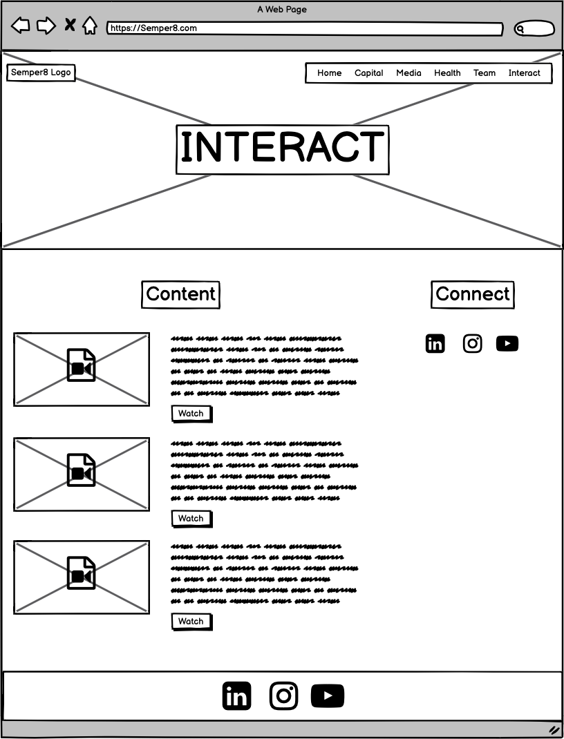
Once the wireframes received approval from the CEO of Semper8, I proceeded to design the final screens using WordPress. My objective was to develop a visual identity that seamlessly aligned with the brand’s values, message, and colour scheme.
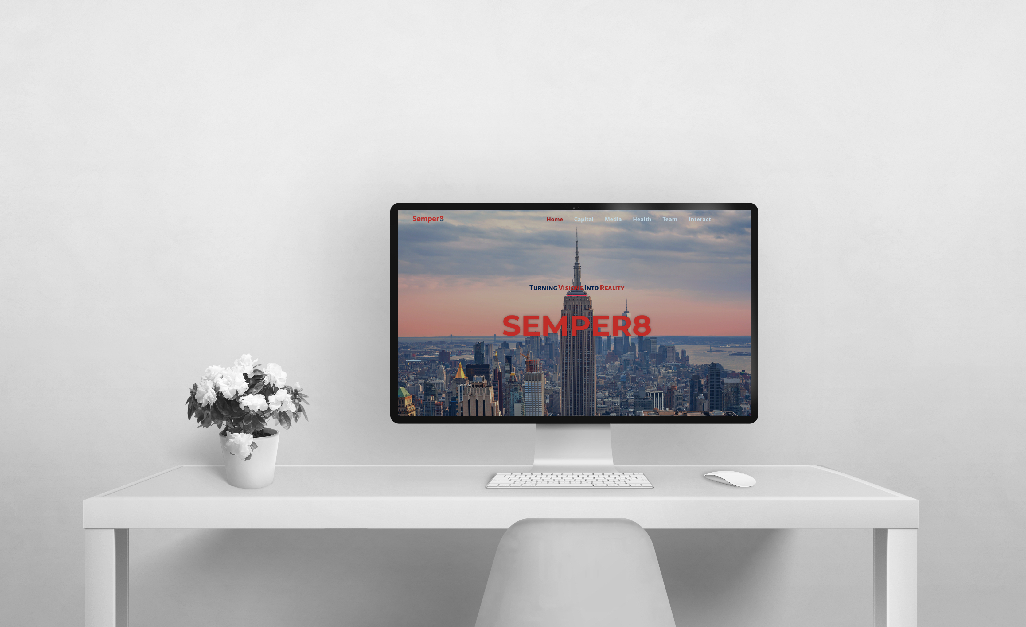
To ensure a successful launch, I conducted final testing to verify all features and functionalities, backed up the website, and implemented robust security measures. The site was also optimized for search engines to enhance visibility. Post-launch, I monitored performance, addressed any issues promptly, and gathered user feedback to make continuous improvements, ensuring the website remained functional, secure, and user-friendly.
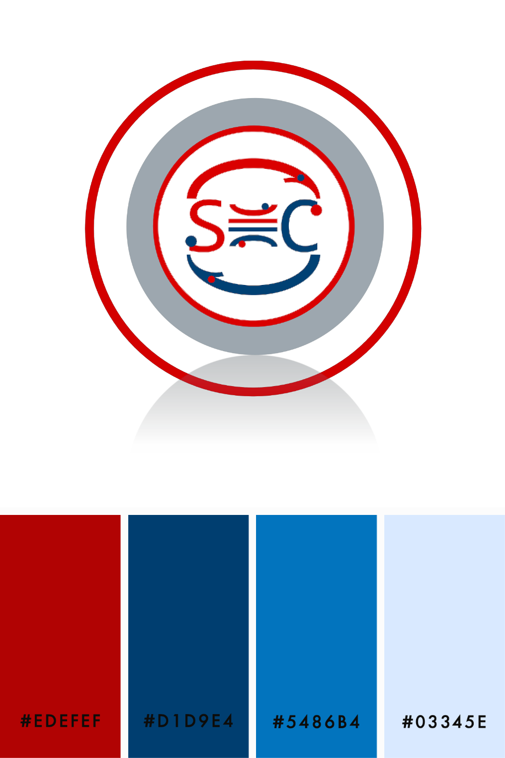
While creating the color palette, I was limited by the restriction on using white to accommodate the client's cultural preferences. Recognizing that white font is often more legible on certain backgrounds, I needed to find an alternative. After numerous trials and adjustments, I determined that a very light blue worked best, maintaining coherence with Semper8's primary colors. This process was a valuable learning experience, challenging my previous design practices and allowing me to experiment with different colors. Ultimately, it taught me the importance of adapting to diverse client needs, enhancing my skills as a designer.